Approximately 75% of consumers can identify a brand by looking at its logo. A company logo is the single most reliable indicator of its identity.
In addition to logos, 60% of people remember businesses by their distinct visual identity, 45% by the brand color, and only 25% by the brand voice.
Therefore, it’s evident that your logo plays a significant role in the memorability of your brand to customers and provides an introduction to your brand.
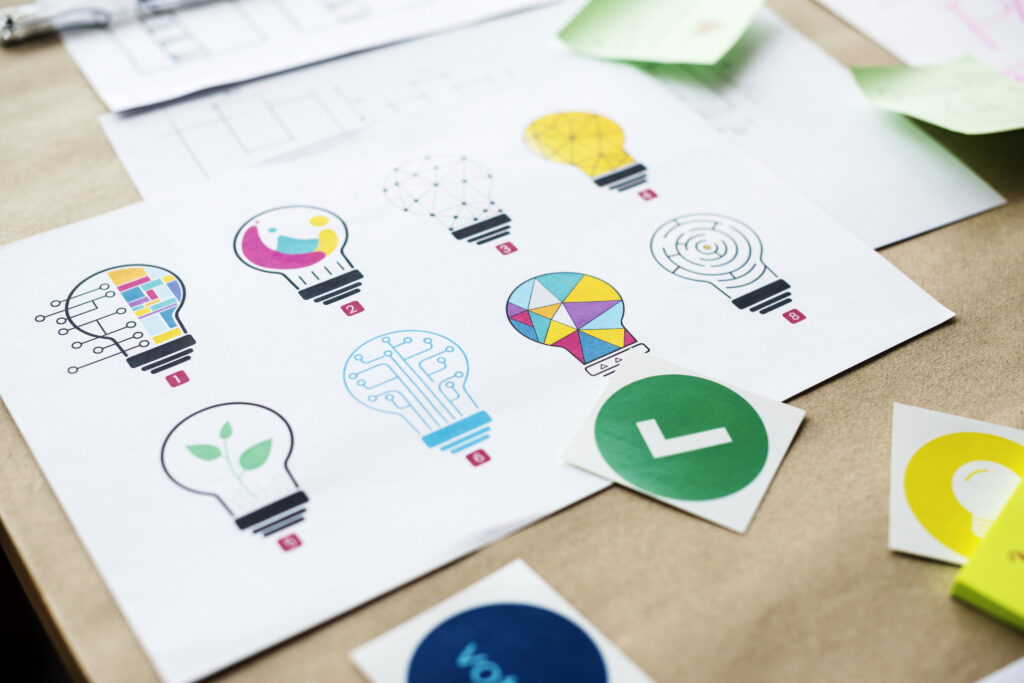
A well-placed logo on your products is an excellent first step in building brand awareness and a devoted following. Logos printed on tangible items have a more significant impact than those shown digitally.
In this article, we’ll examine the logo placement or location and the logo sizing of your print-on-demand products to make them attractive and get the best results.
Why is Logo Placement and Sizing Important?
Putting your logo on POD items will be the first brand identification for potential customers when they see your products. Since your logo strongly influences people’s perceptions of your brand, you must prioritize strategic logo placement and size for two reasons:
- It affects the visibility of your logo
- And how long they remember it.
If the logo placement is wrong, it can be distracting and considerably hamper the design.
Logo Placement Guidelines
When you think of placing the logo on one of your products, you must consider certain considerations properly. Logo placement depends on what product you are putting it on.
So, if you have an Etsy print-on-demand store that sells diverse products, your logo placement strategy will vary from product to product.
Here are a few guidelines to keep in mind when deciding the placement of your logo on print-on-demand products:
Check out competitors.
Investigate the logo placement strategies of other companies. When you notice a brand placing its logos incorrectly, you immediately realize where not to put it on your products.
When something doesn’t seem right concerning other components on clothes or even backpacks or boots, you’ll see it immediately.
Note the successes and failures that you encounter when investigating competitors. Is there a logo there that shares a form with yours? How would you describe the placement, both in terms of what you appreciate and don’t?
Choose the shape mindfully.
Although the logo’s shape may have some product-related significance, using certain conditions in certain places may need to be more comfortable.
Consider the relative prominence of a circle, square, or rectangle in the logo design process if you’ve got a placement. Understand whether or not they warrant valuable space on the merchandise.
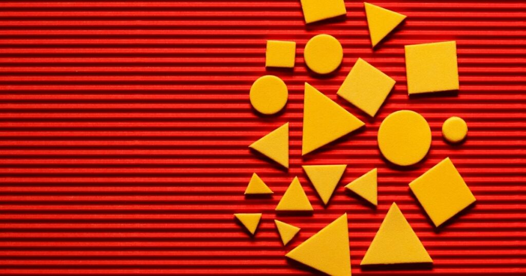
Sometimes, keeping the original shape is wise since it’s already made an impression on your customers, who recognize your brand with it. In such cases, see where the shape feels right and merges with the design.
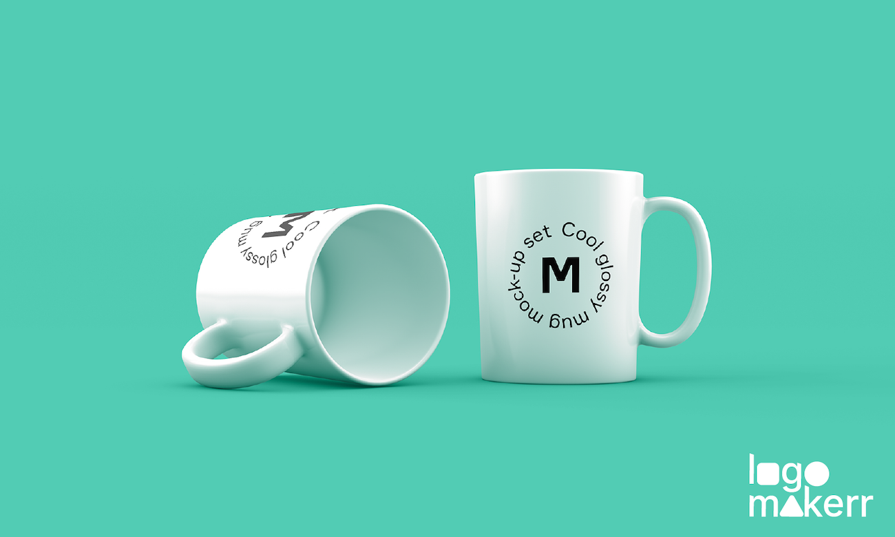
For example, a round logo could go well on a mug, but an elongated logo might need to be appropriately visible as the mug curves.
Place it with Purpose.
When you think about where a logo should be on a product and how it will serve the viewer, the significance of logo placement becomes clear. For example:
- If it’s merely for branding purposes, it could be cornered somewhere in a way that doesn’t obstruct the design, for example, in the tags of the t-shirt.
- If you want it to be out there and visible, it can be centrally placed, for example, in a banner on the t-shirt.
- If you want to brand your merchandise creatively, you can make it a design element, for example, in a logo in the center of a flower graphic on the t-shirt.
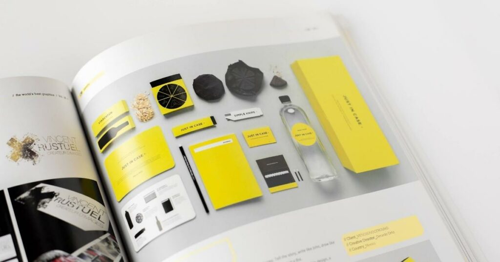
One of the most important functions of logo components that most brands concentrate on is emphasizing their company’s identity. After all, consumers’ perceptions of your goods and services are influenced by the visuals associated with your brand.
Take a break from the design process and consider the optimal spot for the logo to sell your physical products. Do you prioritize the logo or the imagery when developing a customized poster? Or when you’re creating custom paper bags.
You can go right either way, but knowing your end aim will help you decide whether you’d prefer the logo front and center or slightly off to the side.
That’s it! With the above guidelines, you should be able to decide where to place your logo. Now, let’s determine how to size them.
Logo Sizing Guidelines
When you have a print-on-demand business, you’ll need an SVG logo. It is a pixel-independent vector logo file you’ll often use for custom product prints. It can be any size, as a vector logo’s distinctive quality is its unlimited scalability.
Logos work best as vector files since they can be scaled to fit any size print, from business cards to billboards. SVG files are often sent to printers since they allow the logo to be printed in any size.
Determining the size of your logo will depend on its purpose, how much you want it to stand out, and how it fits in the design. For example:
- If you’re printing custom business mouse pads, you should place the logo on them centrally. It could be the only design; hence, it’s often big enough to cover the entire canvas.
- If you’re printing custom banners and your customer wants banners for trade shows, you must keep the logo big enough for people to see from a distance.
Case Studies of Logo Placement and Sizing
Let’s look at two print-on-demand examples– for custom mugs and socks–explaining how logo placement and size might affect the final product.
Case Study 1: Custom Socks
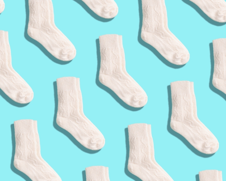
When you place your logo on socks, you can place a small one near them for branding purposes or put it on the sole, just like Calvin Klien’s unique design.
Case Study 2: Custom Mugs
When you brand your mugs with your logo, you want to ensure anyone can see it well from any angle. A circle or rectangle that fits on one face or a vertical design might do well, just like this Disney mug with a Marvel design.

Resources and Tools: Unlocked
There are several tools out there that you can use to create, size, and place logos correctly on your print-on-demand products:
For Logo Designing:
There are several low- or no-cost AI logo makers or logo-creation resources available on the internet nowadays, such as:
- Canva Logo Maker
- Looka
- Logomakerr.ai
- Hatchful
- DesignEvo Free Logo Maker
For vector graphic design:
Adobe Illustrator is the standard tool for designing and editing vector graphics, but it’s not inexpensive, and it’s not always easy to use for newcomers. Free alternatives include Inkscape and Vectr.
Downloading new fonts:
Consider getting more typefaces to make a logo with the brand name. Google Fonts and Font Squirrel are two places you may get free fonts to use in your projects.
Placing and sizing your logo:
For placing your logo on your products, use Printify’s free mockup generator to place your design on the product and check how it’ll look in real life.
Schlussfolgerung
In print-on-demand items, logo positioning and size are of the utmost importance. Enhance brand awareness, grab the attention of potential customers, and present a professional impression by placing your logo strategically and ensuring it’s the right size.
We hope our guidance and examples clarify how to place and size the logo to brand the products sold in your POD shop. Experiment with the tools mentioned here and see what works best for you.
