Logos may sometimes be undervalued in the grand scheme of corporate branding strategy, but they are the visual cornerstones of a brand. If you create well-designed logos and avoid a single logo mistake, that means you can communicate a brand’s values and personality in a simple image, fostering trust and emotional connections with consumers.
As such, logos are vital for brand recognition and play a key role in a brand’s success. After all, an estimated 33% increase in revenue is associated with a company’s visual brand and brand consistency.
Meanwhile, bad logo design can affect your brand negatively. A poorly designed logo will fail to spark initial interest and create a lasting impression of your product. And to be honest, no one wants that.
So, in this article, we will talk about five of the most common and many logo mistake you can do, their impact on your brand, and how you can avoid them.
Logo mistake #1: Overly Complicated Logo Design
Going for a logo design with too many elements can harm your brand or product in several ways. For one, the complexity of your logo can hinder its ability to communicate a clear message. When its design is characterized by too many details, consumers may have a difficult time grasping its meaning and may find it confusing. This, in turn, lessens its effectiveness as a branding and marketing tool.
Of course, with an overly complicated design, your logo may lose its visual impact and fail to register recall. Your target audience would have difficulty identifying it among your competitors’ logos.
Also, a complex logo may be challenging to reproduce accurately across different printing techniques or digital formats. This could lead to inconsistencies in appearance to your branding kit.
Plus, with 42% of consumers saying that logos help convey a brand’s personality, you should be mindful about conveying a powerful personality without trying too hard, a win-win situation if you ask us.
Logo mistake #2: Ignoring Your Target Market
Ignoring your target audience when designing your logo can lead to a disconnect between your brand and its intended consumers. This results in a logo that fails to capture your potential customer’s attention or evoke the emotional response you expect.

Remember that a successful logo should resonate with your target audience by reflecting their preferences, values, and interests. You must first understand your target market’s demographic characteristics, lifestyle choices, and purchasing behaviors to achieve this. Design a logo that speaks directly to their wants and needs.
Okay, but with all these senses, we just want you to remember that an effective logo speaks to its customers. If not, you are definitely at the side of the equation as a brand.
Logo mistake #3: Lack of Originality
Obviously, a lack of originality in logo design can significantly diminish your brand’s ability to attract attention in a crowded marketplace. You will lose the chance to make a positive and lasting impression on your consumers. What’s more, it will fail to differentiate your brand from your competitors and may even lead to confusion or ambiguity among consumers.
And if you were to stand on a generic logo, it gives consumers the impression that you are lazy, unprofessional, lacking in inspiration, or simply don’t care.
Remember that consumers value authenticity and innovation and are likelier to engage with brands that demonstrate creativity and originality in their visual identity.
A distinctive and well-thought-out logo design is essential for establishing a solid brand presence. Logos are often the first impression consumers have of your brand, so ensuring it reflects your company’s values and vision is critical.
To avoid a lack of originality, you need to invest in original and creative logo design. If you don’t have an in-house artist, there are third-party providers you can hire to do it for you. And while there are people who took arts and graphic design majors in college and who claim to be experts at logo design, don’t take their word for it. Look into an artist’s experience and portfolio to ensure you get what you are paying for. Some majors in college, such as marketing or branding, can also provide helpful insights into design strategy, so consider working with professionals who have a deeper understanding of how design impacts business.
The average cost of a logo design typically ranges from $300 to $2,500, which may be too much for startups and small business owners. However, with the rise of AI logo generators, a logo design for your brand can go as low as $29.
Logo mistake #4: Poor Scalability
Imagine a logo that is visually striking on your company website, but is a blurry mess on your business card. That is an example of what happens when your logo design has poor scalability. When your logo does not adapt well to different sizes across different branding applications, mediums, and platforms, it will lose its impact and professionalism.

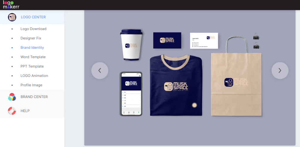
This is why at Logomakerr.ai, we offer product mockups right after you designed your logo. We believe that seeing your branding kits right away can steep you away from costly packaging with a handful of logo mistakes.
Your logo’s versatility is crucial in today’s omnichannel marketing landscape, especially as it needs to make a positive impression on everything, from product packaging to social media posts. In fact, why don’t you try to create a logo now and see how it embeds to your social media postings? Also, is it safe to say that we do that?
To ensure high scalability and versatility in your logo design, you must focus on simplicity. Avoid intricate and overly complex elements, use clear and bold fonts, and go for a design that would register well in high and low resolutions.
Logo mistake #5: Ineffective Color Choices
Source: Unsplash
Colors carry strong psychological associations, and choosing them poorly can send unintended signals. Just picture a daycare center with a logo dominated by dark red and black. These colors might evoke feelings of aggression or danger, which is the opposite of the nurturing and playful environment a daycare aims to convey. Though that’s a little funny to think about, but that plays huge in logo mistakes.
Color combinations can also influence how well your logo will be received by consumers. Clashing combinations or overly busy color palettes can be visually overwhelming and affect recall. As such, choosing colors that complement each other and align with your brand values is essential.
You can read our blog on color combinations to learn more about this.
Abschließende Überlegungen
Avoiding logo mistakes such as over-complicated design, disregard for the target audience, lack of originality, poor scalability, and using ineffective colors is essential for creating a successful and impactful brand identity.
An overcomplicated design can confuse and overwhelm viewers, making it difficult to convey a clear message and diminishing your logo’s effectiveness. Ignoring your target audience can result in a disconnect between your brand and your consumers, leading to disengagement and lack of resonance.
By avoiding these logo mistakes, you can create a memorable, impactful logo that aligns with your overall brand vision and objectives. Of course, if you think you are not on your way to a professional bizarre to be a logo designed, using an AI logo generator always helps!


