What’s the first thing that comes to your mind when you remember a restaurant? Delicious food, excellent service, and a great restaurant should offer all to succeed. In addition, attention to detail is essential in design, atmosphere, and the overall customer experience.
But say you are a stranger to this restaurant; how can you remember it? Most often than not, we remember restaurants not only by their great food but also by their restaurant logos.
A logo is an integral part of a brand identity, and it is essential to have one that stands out from the rest. It must be distinct and memorable so customers can easily recognize your restaurant. The design should also reflect the nature of the food you serve and uniquely represent your brand.
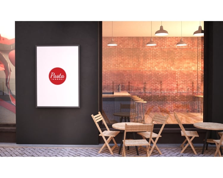
Having a great logo design helps build credibility and trust in your restaurant. So, whether you’re looking for an elegant design or something more contemporary and eye-catching, there’s sure to be something in this list that meets your needs.
Look at these five famous restaurant logo designs and use them as inspiration when creating your unique logo using Logo Maker AI!
Are Logo Designs Really Important For A Resto?
A logo design is a visual representation of your restaurant and helps to create an impact on the customers. It also helps with restaurant marketing, making it easier for people to recognize and remember you.
Most of the time, a resto will heavily rely on its branding or logo, to be specific, to tell the restaurant’s story, what you offer, and what makes you different. This branding extends to all digital aspects of your business, even when you go to make a menu online. It should consistently reflect your restaurant’s narrative.
Hence, a restaurant logo design should be unique, creative, and memorable so your customers will connect emotionally. And a good restaurant logo can create an unforgettable impression and make your restaurant stand out. Effective restaurant branding goes beyond just the logo, encompassing the entire visual identity and customer experience to create a cohesive and compelling brand story.
At first, designing a logo for your restaurant may seem intimidating, but with an AI logo maker, you can easily create a custom logo that reflects your brand’s essence.
5 best restaurant logos to use as an Inspiration for your brand
In selecting our 5 top picks for the best restaurant logos, we used the following criteria: color, typography, and overall design. These logos have stood the test of time and remain popular today.
By getting inspired by these restaurant logo ideas, you can easily create a memorable logo for your restaurant in no time.
McDonald’s
The iconic golden arches of McDonald’s are one of the most recognizable logos in the world. This simple yet effective design has been used for decades and is still highly popular today.
When creating a logo for your restaurant, there are several points to consider to develop an effective design. First, you should choose colors that reflect the atmosphere and vibe of your restaurant.

McDonald’s, for example, uses yellow in their logo, conveying energy and joy. This is an essential aspect the restaurant’s brand as it sets them apart from other fast-food restaurants.
Another important factor is typography. McDonald’s logo uses a bold, sans-serif font which helps to create an impactful impression and makes the logo easier to read. Additionally, their iconic arches give the logo a unique look that customers can easily recognize and remember.
KFC
Another iconic example of a restaurant logo is that of KFC – Kentucky Fried Chicken.
The KFC logo is an excellent example of using a vector image to create an impactful impression. Using a vector image allows the logo to remain clean and crisp, regardless of size.
Read here: Raster Vs Vector Images: What Makes Them Different From Each Other?
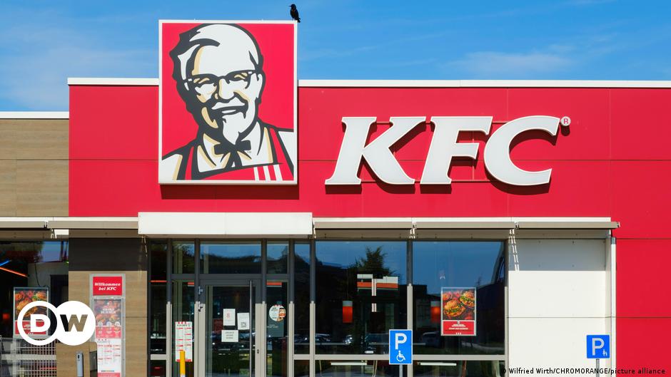
The main element of this logo is the red and white stripes running horizontally across the center. The colors are bright and eye-catching and convey a sense of fun. The typography is bold, modern, and easily recognizable from far away.
It also uses an image of a man as part of its logo element – and we can see that it’s definitely effective! This logo has remained the same since 1952, with minor updates to make it more modern and appealing.
Subway
The Subway logo is one of the most appealing restaurant logo designs out there. The overall design conveys a sense of speed and freshness which are essential factors in the restaurant industry.
When making a logo, choosing colors that show the kind of restaurant you are in is essential, and the colors should make people feel happy and excited.
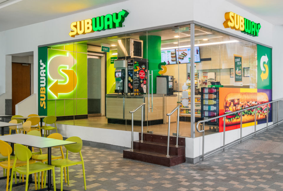
Subway uses yellow, which looks bright and cheerful. Typography should be bold and easy to read, like Subway’s logo. Also, use an image that reflects your restaurant if you can; it will help people know what your restaurant is about fast service.
Pizza Hut
The Pizza Hut logo has remained almost unchanged since its inception in 1958. This recognizable red roof design conveys a sense of reliability and trustworthiness. The typography is strong and modern, while the bright red color grabs attention and conveys a sense of warmth and excitement.
The Pizza Hut logo is also straightforward. It has been the same for a long time, and people recognize it immediately. The red color makes it look exciting, and the strong font looks modern, and this kind of minimalism in a logo helps people remember it easily.
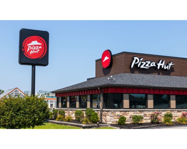
Minimalism is a good practice in design because it allows for the most efficient communication of ideas. By utilizing only the most essential design elements, designers can create impactful visuals that are easy to understand and immediately engaging.
Read here: How Does Minimalist Logo Looks Like? (15 Minimalist Logo Inspiration)
Burger King
Last but not least, we have the classic Burger King logo. Its logo design features a bold black crown at its center, symbolizing power and authority.
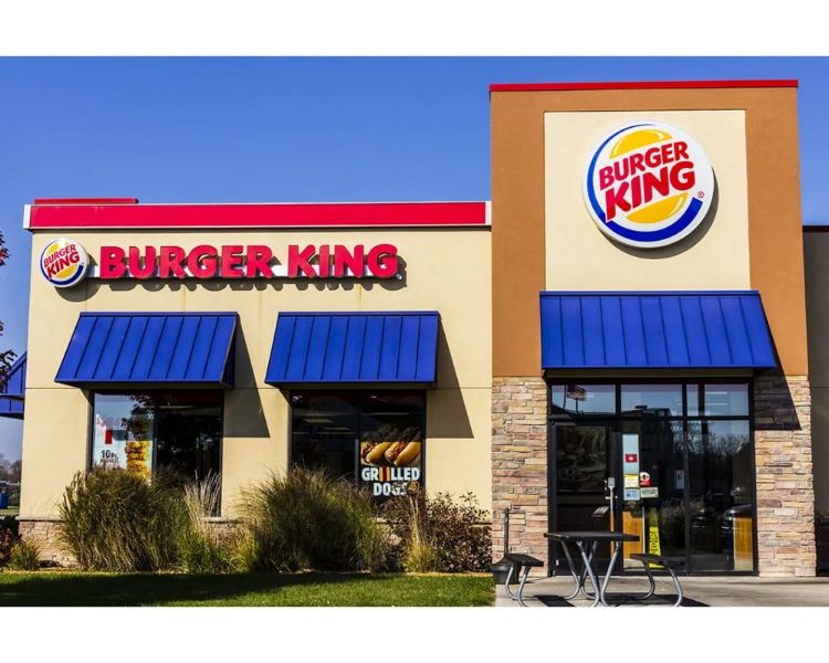
This logo is an example of an appealing restaurant logo that uses an image to grab attention and tell your story. The crown conveys power, while the colors show energy and excitement.
The font you choose for your logo is crucial because it helps people to recognize and remember your logo. Making sure you pick a good font will help people notice your logo faster!
Abschließende Überlegungen
Creating your own restaurant logo and making it effective are two difficult tasks, but they can be done with careful research and consideration of all the design elements mentioned above.
By choosing colors, typography, and images that reflect your restaurant’s atmosphere, you can create a unique restaurant logo design that will help customers remember and recognize your restaurant.
From classic designs to modern minimalistic looks, these iconic logos has been part of brand development and continuously inspire designers today.
Whether you’re looking for an elegant design or something more contemporary and eye-catching, there’s sure to be something in this list that meets your needs.
But how can you get started? With Logo Maker AI, you can use our custom restaurant logo maker to create a professional logo for your restaurant quickly. It will also provide you with all the tools you need to make your perfect logo within minutes!
