A realtor logo is a very important part of your brand identity. It will be seen on business cards, signs, flyers, and other marketing materials. A good logo inspires trust in potential customers and helps them remember you when they are looking for a new home or office space.
We will share the factors you must consider if you design a new realtor logo in the 2023. It is important to note that the factors we will discuss below are not the only things you should consider when designing a new logo. They are some of the more important ones, however, and they will help you get started in creating your own unique realtor logo.
Pick a right symbol
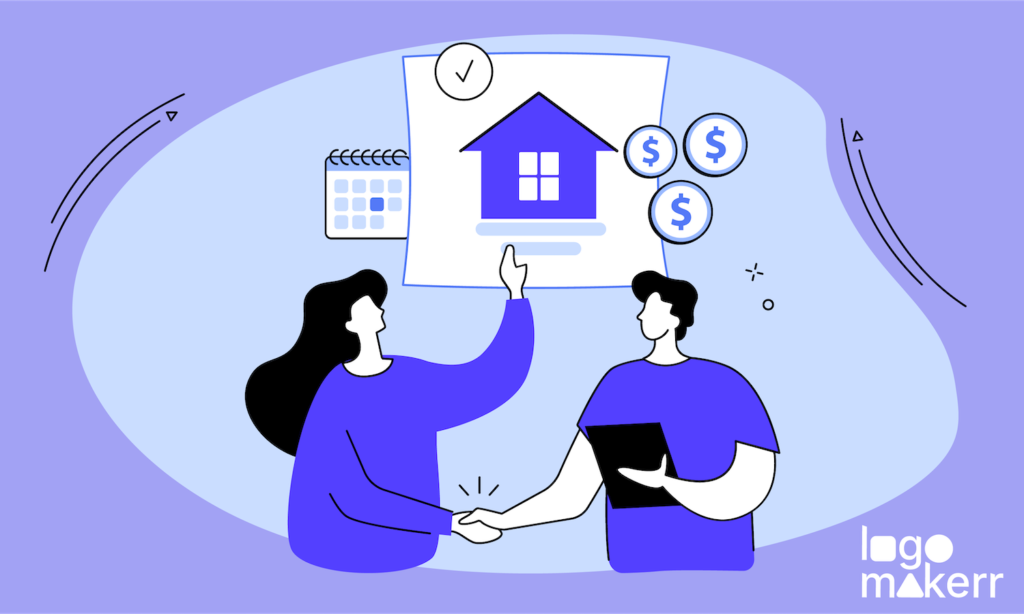
A symbol speaks a thousand words, it’s a major element of your logo. It’s what your clients will remember, and it’s what they’ll see in their heads when you tell them about yourself. It is important to choose a symbol that represents your real estate services.
For example, if you focus on selling condos, use an icon of a condo in your logo. Symbols are not limited to pictures and icons. You can also use words, numbers, or letters as symbols. For example, if your real estate agency focuses on selling homes in the North Shore area of Chicago, use “North Shore” or even just “N” as a symbol.

Consider the colors
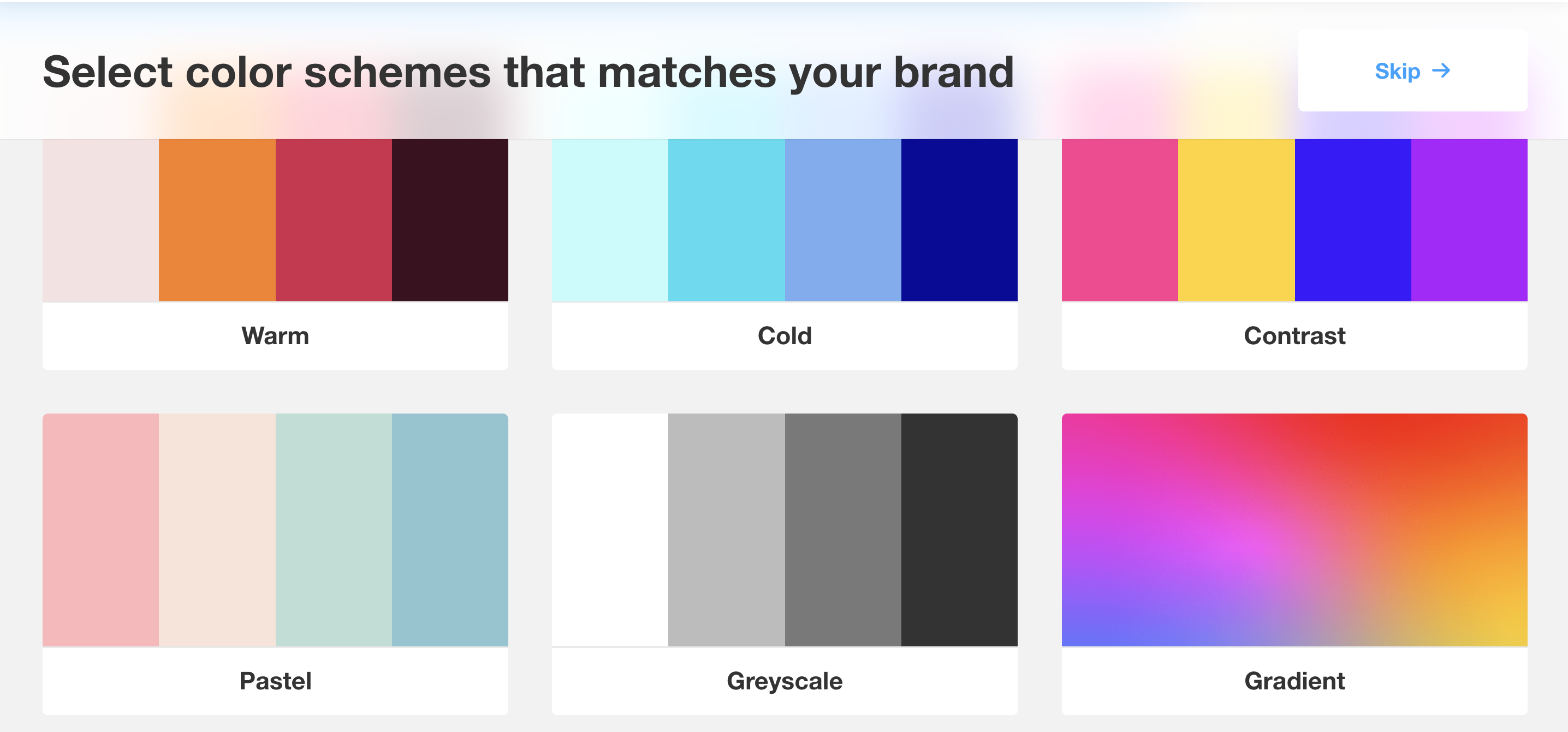
Colors are a very important part of your logo design. You should choose colors that are related to real estate, but avoid colors like pink, purple and yellow, these are too fancy for realty.
If you are targeting worldwide, don’t use the color code of the US flag (blue #002868, red #BF0A30). The best way to make this decision is by understanding your target audience:
- Determine what your brand will look like. What colors do you want it to have? What fonts would be appropriate? Will there be any images involved in the logo?
- Choose one or two colors as a base for your design (usually black or white) then add additional colors that work well with these bases depending on what you’re trying to convey about yourself and the business
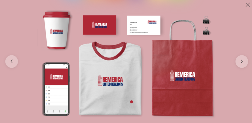
Consider the layout
The layout of your logo is another important consideration. It’s all too easy to overlook the small details, but they can make or break a logo design.
To be successful as a real estate agent, you’ll need to hand out lots of business cards (so everyone knows who you are), and also make sure that people see your name wherever they go (such as on a big sign in front of the house) so they can easily recognize it even if they’re driving by at 80 mph.
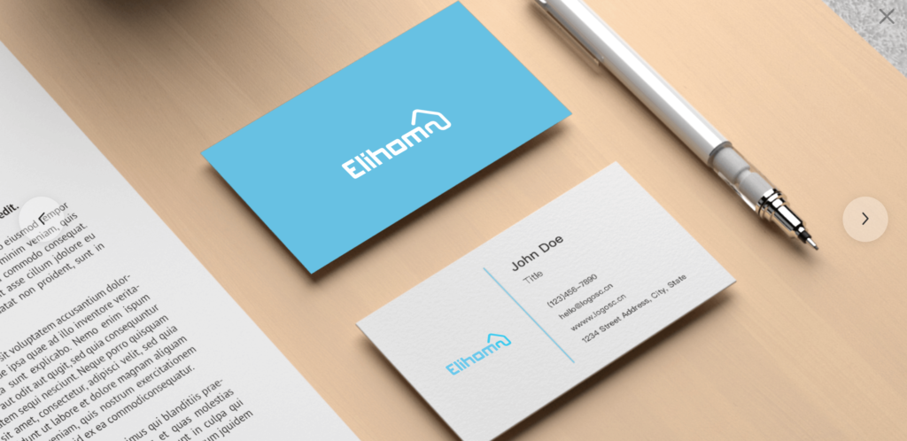
Besides, your company’s social media profiles often have square images, so it’s best to keep your logo in that same shape. This will help it fit in seamlessly with the rest of your design team’s work and give you consistency across all platforms.
The text and font
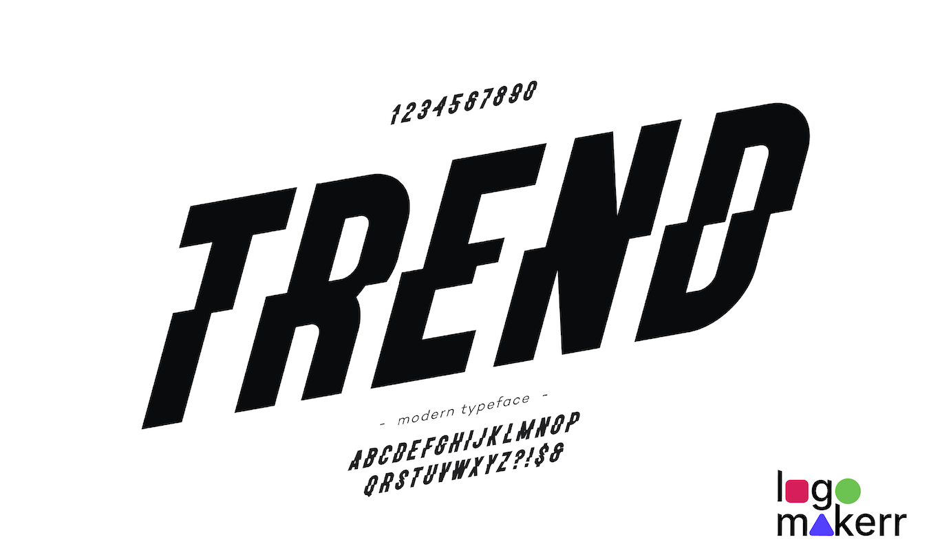
When it comes to font selection, the general rule of thumb is to make your logo easy to read in both print and online mediums. A good rule of thumb for choosing a font for your real estate logo is to use a bold, serif font that’s easy on the eyes.
Serif fonts (like Calibri) have small decorative lines at the end of each stroke, which makes reading more comfortable for people who spend long hours looking at text documents—like real estate agents! Some examples of popular realtor fonts include:
- Century Gothic
- San Serif
- Georgia
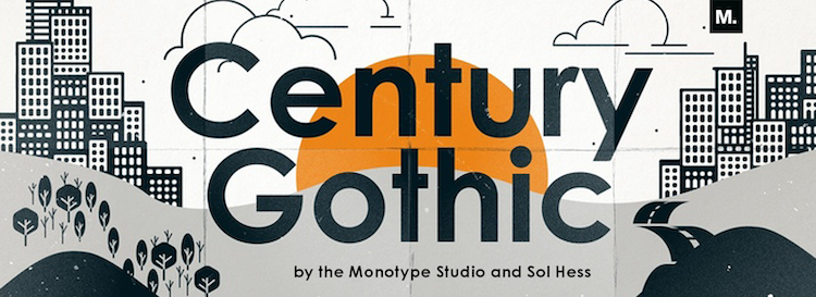
While these are all great options when it comes to font selection on regular business cards or brochures (for example), they may not be right for every real estate agent’s website or blog posts. If you want something different than these classics but still want legibility and professionalism, consider experimenting with a signature logo like Trajan Pro or Montserrat instead!
Don’t put the company’s full name
The first tip is not to put your company’s full name on the logo. There are three main reasons for this:
- It’s too long and clutters up the design.
- It doesn’t fit in with a design style that uses only a few words, like “realtor” or “real estate.”
- If you’re working with more than one company at a time, it makes it harder to use the logo across different clients’ materials and websites.
How to make your new realtor logo with Logomakerr.AI
To get started, you’ll need to choose a font. Some popular fonts for realtors include Century Gothic, Helvetica Neue, and San Serif are under the Elegant category. Then, select a color scheme that matches your brand identity and logo’s purpose. From there, you can add text to the slogan or any other words (such as “real estate agent”, “realty” or you may include the region or state of your service coverage) that you want to appear on the logo.
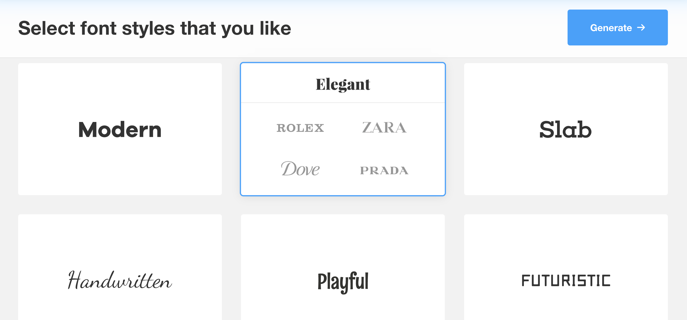
When you’re done designing your own realtor logo with Logomakerr.AI, download it in high-resolution format like SVG, EPS so you can use it wherever needed with the PRO plan that costs only $59.
You can create a realtor logo in no time with Logomakerr.ai
You can create a realtor logo in no time with Logomakerr. The logo maker is available on all devices, so you can use it anywhere and anytime—whether at home or on your phone. And it takes an average of only five minutes to make a professional-looking design! The logo maker has many useful features. You can choose from a variety of colors and fonts or upload your own custom graphics like the initial of your business name or a specific icon.
Logomakerr’s free Ai logo maker makes it easy for anyone to create their company logos. The website is full of professional-quality logo design templates that you can personalize with your name and contact details within minutes!
Start with just one click: select from one of our many unique logo templates or start from scratch with our blank template. Once your new brand identity is created using Logomakerr, you’ll have an attractive visual representation that shows others what sets apart your business from competitors — including the templates for business cards, posters and social media posts.
Find out by visiting logo templates on Logomakerr for:
Schlussfolgerung
Hopefully, we’ve given you some great ideas on how to design a real estate logo. As we said before, there are so many different ways to go about it and you’re bound to find something that works for your brand and personality. Even if it isn’t perfect, just keep experimenting until you get there!
